
When it comes to maintaining quality in your processes, Statistical Process Control (SPC) charts can be invaluable. They help you track performance over time and identify variations that could impact quality. Understanding how to effectively use these charts is crucial, but it requires more than just basic knowledge. What are the key components you need to consider, and how can you overcome potential challenges? Let's explore these aspects further.
Understanding Statistical Process Control (SPC)
Understanding Statistical Process Control (SPC) is essential for anyone looking to enhance quality management in their processes.
SPC helps you monitor and control your processes using statistical methods, ensuring they operate at their full potential. By analyzing data from your production processes, you can identify trends, variations, and potential issues before they escalate.
This proactive approach allows you to make informed decisions and implement corrective actions swiftly. You'll also foster a culture of continuous improvement, as SPC encourages collaboration and data-driven discussions among team members.
Embracing SPC not only leads to better quality outcomes but also boosts efficiency and reduces waste, ultimately contributing to your organization's success. Additionally, utilizing statistical analysis in SPC can provide deeper insights into process performance and variation.
Start leveraging SPC today to transform your quality management journey.
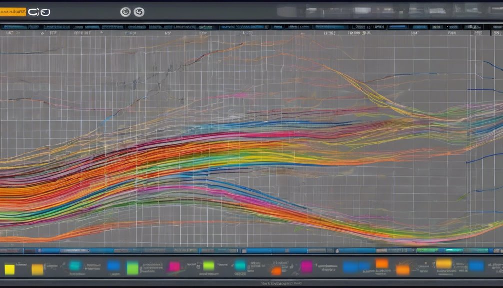
Types of SPC Charts
When you're implementing Statistical Process Control (SPC), choosing the right type of chart is crucial for effectively monitoring your processes.
You'll primarily encounter two main types: variable charts and attribute charts. Variable charts, like X-bar and R charts, focus on continuous data, allowing you to assess measurements such as weight or temperature.
On the other hand, attribute charts, such as p-charts and c-charts, deal with count data, helping you track defects or nonconformities in a sample.
Each chart serves a specific purpose, so consider your data type and what you need to monitor.
Key Components of SPC Charts

SPC charts consist of several key components that help you effectively monitor and analyze process performance. The central element is the data points, which represent measurements taken over time.
You'll also find control limits, typically set at three standard deviations above and below the process mean. These limits help you identify variations in performance.
The process mean, or average, is another crucial component, providing a baseline for comparison. Additionally, you may include a time axis to track changes, along with annotations for significant events or changes in the process.
Lastly, trend lines can highlight patterns, allowing you to visualize process behavior over time. Understanding these components is essential for effective SPC chart utilization.
Benefits of Using SPC Charts
Harnessing the power of SPC charts can significantly enhance your process management. By implementing these charts, you'll gain real-time insights into your processes, allowing you to identify variations and trends quickly.
This proactive approach helps you address issues before they escalate, reducing waste and improving quality. Additionally, SPC charts foster a culture of continuous improvement within your team, as everyone can see the impact of their efforts on performance.
You'll also enjoy enhanced decision-making capabilities, as data-driven insights remove guesswork. Furthermore, using SPC charts can lead to increased efficiency and productivity, ultimately driving down costs. This aligns with the principles of Six Sigma, ensuring that your organization continually strives for operational excellence.
How to Create an SPC Chart

Creating an SPC chart starts with collecting relevant data from your process. Make sure you gather consistent measurements over time, focusing on specific variables that reflect your process performance.
Once you have your data, calculate the mean and standard deviation. These values will help you establish control limits—typically set at three standard deviations above and below the mean.
Next, plot your data points on the chart, marking the centerline (mean) and control limits. As you plot, look for trends or patterns that may indicate issues.
Finally, regularly update your chart with new data to maintain its effectiveness. By following these steps, you'll create an SPC chart that helps monitor your process and improve quality.
Interpreting SPC Chart Data
Once you've plotted your data points and established control limits, it's time to interpret what the chart reveals about your process.
Look for points that fall outside the control limits; these indicate potential issues that need investigation. If you see trends—like a series of points steadily increasing or decreasing—this might suggest a systematic change in your process, prompting further analysis.
Pay attention to any runs of consecutive points on one side of the center line, as these could signal a shift in process behavior. Remember, significant deviations require action, while points within control limits suggest your process is stable.
Common Challenges in Implementing SPC

Implementing Statistical Process Control (SPC) can present several challenges that may hinder its effectiveness.
First, you might struggle with data collection methods. If the data isn't accurate or timely, your SPC charts won't reflect true performance.
Second, resistance from team members can arise; people often fear change or misunderstand SPC's purpose. It's crucial to communicate its benefits clearly.
Third, a lack of training can lead to improper chart interpretation, making it hard to identify trends or variations.
Lastly, integrating SPC into existing processes can be tricky, especially if your organization isn't aligned on quality goals. Addressing resistance to change can significantly improve your SPC implementation, leading to better quality control and enhanced operational performance.
Case Studies: SPC in Action
When you explore real-world applications of Statistical Process Control (SPC), you'll find compelling case studies that highlight its effectiveness across various industries.
For instance, a manufacturing company reduced defects by 30% after implementing SPC, allowing them to identify process variations early.
In the food industry, a company used SPC to monitor temperature control, minimizing spoilage and ensuring food safety.
Similarly, in healthcare, a hospital applied SPC to track patient wait times, leading to a significant improvement in service delivery.
These examples show how SPC can drive continuous improvement, enhance quality, and increase efficiency.
Best Practices for Maintaining SPC Charts

To effectively maintain SPC charts, it's crucial to regularly review data inputs and ensure accuracy. Check for any anomalies or errors in the data collection process.
Train your team on proper data entry techniques to minimize mistakes. Make it a habit to update your charts consistently, ideally in real-time, so you can respond quickly to any trends or issues.
Set a schedule for reviewing and analyzing the charts, allowing for timely adjustments in processes. Encourage open communication among team members about findings and insights from the charts.
Lastly, document any changes made to the process and charting methods so you can track improvements over time. Following these best practices will help you maximize the effectiveness of your SPC charts.
Conclusion
In conclusion, using Statistical Process Control charts can significantly enhance your process management and quality control efforts. By understanding the different types of SPC charts and their key components, you can effectively monitor and improve your processes. While challenges may arise during implementation, sticking to best practices will help you maintain accurate and valuable SPC charts. Embrace the power of SPC to drive continuous improvement and make informed decisions that elevate your organization's efficiency and quality.