
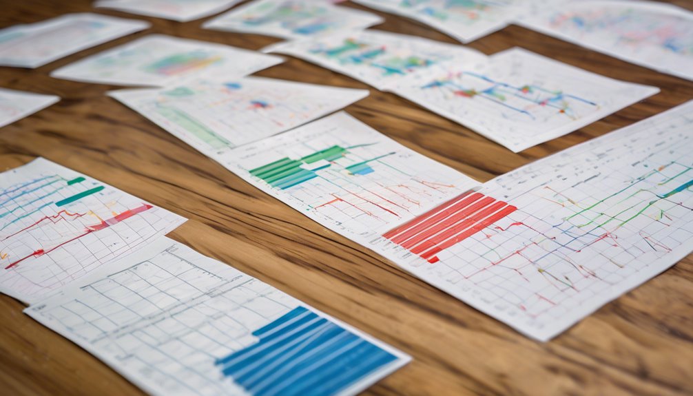
When it comes to quality control, understanding the various types of control charts is essential. Each chart serves a specific purpose, whether you're monitoring process mean, variability, or defect rates. Knowing which chart to use can make a significant difference in your analysis. As you explore the different types, you might find that some are better suited for your needs than others. Let's break down these key tools and see how they can enhance your process management.
X-bar and R Charts

X-bar and R charts are essential tools in quality control, especially when you're monitoring the mean and variability of a process over time.
These charts help you track changes in a process by displaying sample means (X-bar) and the range (R) of the samples. When you collect data, you calculate the average and range for each sample, plotting these values on their respective charts.
If your points fall within the control limits, your process is considered stable. However, if you spot points outside these limits or patterns, it signals a potential issue that needs your attention.
X-bar and S Charts
When monitoring process stability, X-bar and S charts offer a powerful alternative to X-bar and R charts.
These charts help you track the mean and standard deviation of a process over time, making them ideal for situations where sample sizes vary. With X-bar and S charts, you can detect shifts in the process mean and changes in variability quickly.
You'll calculate the average of your samples (X-bar) and the standard deviation (S) to plot your data. This approach gives you a more detailed view of your process's performance.
P Charts
In many quality control scenarios, P charts serve as an essential tool for monitoring the proportion of defective items in a process. They help you track the percentage of nonconforming units over time, providing valuable insights into process stability.
When you set up a P chart, you'll plot the proportion of defects for each sample against control limits, which are calculated based on your data. This allows you to quickly identify any trends or shifts in quality that may require corrective action.
You'll find P charts particularly useful when dealing with attribute data, such as pass/fail results. By regularly reviewing your P charts, you can maintain product quality and enhance your overall process efficiency.
NP Charts
NP charts are a powerful alternative to P charts, specifically designed for monitoring the number of defective items in a fixed sample size.
Unlike P charts, which focus on proportions, NP charts track the actual count of defects, making them suitable for scenarios with constant sample sizes.
When you use NP charts, you'll plot the number of nonconforming items against control limits determined by historical data. This allows you to quickly identify variations or trends that might indicate a problem in your process.
By keeping a close eye on these charts, you can take timely corrective actions, ensuring product quality remains consistent.
C Charts
C charts serve as an essential tool for monitoring the count of defects in a sample where the opportunity for defects varies.
You'll use this type of control chart when you want to track the number of defects per unit of measurement, like items produced or areas inspected. Unlike other charts, C charts focus specifically on the count of defects, making them ideal for processes where defects can occur multiple times.
To create a C chart, you'll plot the number of defects against time, allowing you to identify trends or shifts in your process. By analyzing this data, you can quickly spot any variations that might signal a need for corrective action, ensuring your quality control remains effective.
U Charts
While monitoring processes with varying sample sizes, U charts become invaluable for tracking the number of defects per unit of measurement.
They're particularly useful when you want to evaluate processes where items mightn't be consistent in size or count. With U charts, you can effectively visualize data over time, helping you identify trends and variations in defect rates.
You'll plot the number of defects per unit against time, establishing control limits to assess whether your process is stable. If data points fall outside these limits, it signals a need for investigation.
Conclusion
In summary, understanding the different types of control charts is essential for effective quality control. Whether you're tracking means and variability with X-bar and R charts or monitoring defects with P and C charts, each tool serves a unique purpose. By choosing the right chart for your needs, you can gain valuable insights into your processes, ensuring they remain efficient and consistent. So, make sure to leverage these charts to enhance your quality management efforts!