When you encounter a right-skewed distribution, you need to pay close attention to how it affects your analysis. It's not just the numbers that matter; the way they're spread can significantly influence your conclusions. The mean and median often tell different stories, and outliers can distort your understanding. If you're curious about how to interpret these patterns effectively, you might want to consider the implications for your research.
Right-skewed distributions require careful analysis because the mean is typically higher than the median, and outliers on the right side can distort conclusions. Recognizing this asymmetry is essential for selecting appropriate statistical methods and accurately interpreting data.
Understanding Skewness in Data Distribution

Have you ever wondered how the shape of a data distribution can impact your analysis? Understanding skewness is crucial in interpreting your data effectively.
A skewed distribution isn't symmetrical; instead, it leans toward one side, indicating that most data points cluster around a certain value while trailing off on the other end. If you're analyzing right-skewed data, you'll notice a long tail on the right side.
This can affect your mean and median, making the mean higher than the median. Recognizing skewness can help you choose the right statistical tests and models, ensuring your conclusions are accurate.
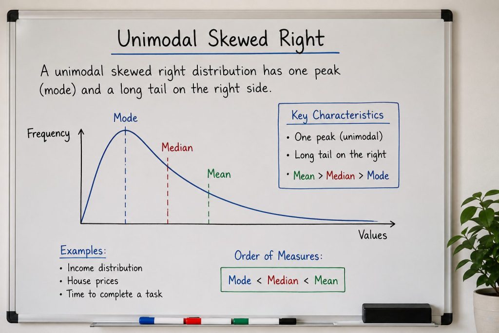
Characteristics of Right-Skewed Distributions
Right-skewed distributions have distinct characteristics that set them apart from symmetrical ones. In these distributions, the tail on the right side is longer or fatter, indicating that higher values occur less frequently but can significantly affect the mean.
You'll notice that the median often lies to the left of the mean, reflecting the influence of those higher values. Additionally, the majority of data tends to cluster on the left side, creating a peak that's shifted toward the lower end.
This asymmetry can impact your analyses, suggesting that you should be cautious when interpreting averages. Recognizing these traits helps you understand the data better and make more informed decisions based on your findings.
The Impact of Outliers on Skewness
Outliers can significantly influence the skewness of a distribution, especially when they fall on the higher end. When you have extreme values that are much larger than the rest of your data, they pull the mean to the right, creating positive skewness.
This shift can obscure the true center of your dataset, making it seem more lopsided than it actually is. You might notice that without these outliers, the distribution could appear more balanced.
It's crucial to identify and analyze these outliers, as they can distort your results and interpretations. By understanding their impact, you can make more informed decisions about how to handle your data, whether by excluding them or using robust statistical methods.
Comparing Mean and Median in Right-Skewed Data
When analyzing data, the relationship between the mean and median becomes particularly important in distributions affected by outliers.
In right-skewed data, you'll often notice the mean is greater than the median. This happens because the mean is sensitive to extreme values on the right side, which pulls it upward.
On the other hand, the median, representing the middle value, remains more stable and accurately reflects the central tendency of your data.
When you encounter right-skewed distributions, rely on the median for a better understanding of typical values.
It's crucial to recognize these differences, especially when drawing conclusions or making decisions based on your data analysis. Understanding this relationship helps you interpret your findings more effectively.
Visualizing Right Skewness With Graphs
To better grasp the concept of right skewness, visualizing the data through graphs can be incredibly helpful.
When you look at a histogram of right-skewed data, you'll see a long tail extending to the right. This tail represents the higher values that occur less frequently. The bulk of the data clusters to the left, with most values being lower.
By plotting a box plot, you can also observe how the median shifts left of the mean, highlighting that the data isn't symmetrically distributed.
Scatter plots may further illustrate the relationship between variables, showing how right skewness impacts overall trends.
These visual tools make understanding right skewness more intuitive, allowing you to interpret data patterns effectively.
Applications of Right Skewness in Real-World Scenarios
Understanding how right skewness manifests in real-world scenarios can enhance your ability to interpret various data sets effectively.
In fields like economics, income distribution often displays right skewness, where a small number of individuals earn significantly higher incomes than the majority. This insight can help you assess economic inequality.
Similarly, in healthcare, the distribution of patient wait times may skew right, indicating that while most patients wait a short time, a few experience long delays. Recognizing these patterns allows you to prioritize resource allocation.
In environmental studies, the amount of rainfall can also be right-skewed, helping you predict droughts or floods.
Statistical Methods for Analyzing Skewed Data
Analyzing skewed data requires specific statistical methods to ensure accurate interpretations. First, you might consider using non-parametric tests, like the Mann-Whitney U test, which don't assume normal distribution. These tests are great for comparing medians rather than means.
Additionally, bootstrapping techniques can help you estimate confidence intervals without relying on normality assumptions. When summarizing skewed data, focus on reporting the median and interquartile range instead of the mean and standard deviation.
Visualization methods, like box plots or histograms, can also provide insights into the data's distribution. Lastly, you may want to apply robust statistical methods that minimize the influence of outliers, ensuring that your analysis remains accurate and meaningful in the face of skewed data.
Transformations to Address Right Skewness
When dealing with right-skewed data, employing transformations can significantly improve your analysis by stabilizing variance and making the data more amenable to standard statistical techniques.
Common transformations include the logarithmic, square root, and cube root transformations.
Using a logarithmic transformation, for instance, can compress large values while spreading out smaller ones, effectively reducing skewness. The square root transformation is another option, especially useful for count data.
If you're working with data that contains zeros, the cube root transformation can be a suitable alternative.
Ultimately, choosing the right transformation depends on your specific dataset and the goals of your analysis. Experimenting with these methods can lead to more accurate interpretations and insights in your work.
Case Studies of Right-Skewed Datasets
Transformations can make a significant difference in how you interpret right-skewed data, but real-world examples often highlight the challenges and patterns that emerge in such datasets.
For instance, consider income data in a population where a small number of high earners inflate the average. You might find that most individuals earn below a certain threshold, leading to a deceptive impression of financial health.
Another case is response times in online surveys; a few respondents might take much longer than others, skewing the overall average.
These cases underscore the necessity of understanding the underlying distributions. By analyzing right-skewed datasets in context, you can draw more accurate conclusions and avoid misrepresenting the data's story.
Best Practices for Reporting Skewed Data in Research
Reporting skewed data in research requires careful consideration to ensure accuracy and clarity. First, always describe the nature of the skewness in your data, specifying whether it's right-skewed or left-skewed.
Use appropriate summary statistics: report the median and interquartile range instead of the mean and standard deviation, as they better represent your data's central tendency and variability. Visual aids like histograms or box plots can effectively illustrate the distribution, making it easier for readers to grasp the data's characteristics.
Be transparent about any transformations you applied and how they impacted your analysis. Finally, discuss the implications of the skewness on your findings, ensuring your conclusions reflect the data's true nature. This approach enhances the credibility of your research.
Conclusion
In summary, understanding right-skewed distributions is crucial for accurate data analysis. By recognizing the characteristics and impacts of outliers, you can better interpret your findings. Always compare the mean and median to get a clearer picture, and don't hesitate to use visualizations to illustrate your data. Employ non-parametric methods and report medians and interquartile ranges to ensure your results are reliable. Following these best practices will enhance the clarity and accuracy of your research outcomes.