When analyzing data, you might encounter a skewed left graph, where the bulk of data points lean toward higher values. This distribution can significantly alter your interpretation of the data, especially in fields like education or income. Understanding the implications of this skewness offers valuable insights. But what does it really mean for your analysis, and how can you effectively address it? Let's explore further.
A skewed left graph, or negatively skewed distribution, has a long tail on the left with most data clustered at higher values, where the mean is typically less than the median. Recognizing this skewness is crucial for accurate data interpretation, as relying solely on averages can be misleading.
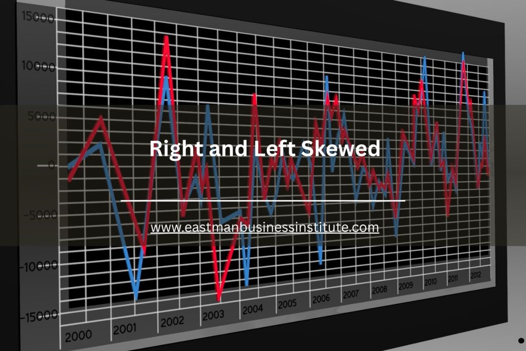
Understanding Skewness in Distributions
When you analyze data distributions, understanding skewness is crucial because it reveals how your data is spread. Skewness measures the asymmetry of your data around the mean.
If the data leans to the right, you've got positive skewness, indicating a tail on the right side. Conversely, a left skew shows that your data tails off to the left.
Identifying skewness helps you interpret the distribution accurately and makes it easier to choose the right statistical tools. For instance, normal distribution assumes symmetry, so recognizing skewness can guide your analysis.
Characteristics of a Skewed Left Graph
A skewed left graph, often referred to as negatively skewed, features a longer tail on the left side of the distribution.
In this type of graph, most data points cluster toward the higher end, with a few lower values stretching out to the left. You'll notice that the mean is typically less than the median, as the few low values pull the average down.
This creates a visual representation where the bulk of the data lies on the right, making it easier to identify trends. Additionally, the presence of outliers on the left can significantly impact the shape of the distribution.
Understanding these characteristics can help you interpret data patterns effectively and make informed decisions.
Real-World Examples of Left Skewness
How often do you encounter situations where data is skewed left? You might see this occurrence in fields like education, where test scores can show a cluster of high achievers, leaving a few lower scores on the left.
Similarly, in income distribution, most people earn above the average, with fewer individuals earning significantly less, creating a left-skewed graph.
Another example is age at retirement; most people retire around the same age, but a handful may retire much earlier, pulling the data left.
In health studies, the ages of patients with certain diseases can also exhibit left skewness if younger patients are less common.
Recognizing these examples helps you better understand the implications of left-skewed data in various contexts.
Implications of Left Skewness in Data Analysis
Understanding the implications of left skewness in data analysis is crucial for drawing accurate conclusions. When your data is left-skewed, it indicates that a majority of values cluster on the higher end, with a tail extending toward lower values.
This often means that the mean will be less than the median, which can misrepresent the data's central tendency if you rely solely on averages. You'll need to consider how this skewness affects your interpretations, especially in decision-making processes.
For instance, outliers can significantly influence results, leading to potential miscalculations. Recognizing left skewness allows you to adjust your analysis strategies, ensuring you're not overlooking vital insights that could come from understanding the distribution's shape.
Techniques for Identifying Skewed Left Distributions
Identifying left-skewed distributions is key to ensuring your analysis accurately reflects the data's nature.
To spot a left skew, start by examining the histogram. Look for a longer tail on the left side, indicating that lower values are more spread out. You can also calculate the skewness coefficient; a negative value suggests left skewness.
Additionally, compare the mean and median: in left-skewed data, the mean will typically be less than the median. A box plot can also help; if the left whisker is significantly longer than the right, that's a sign of left skew.
Finally, using statistical tests like the Shapiro-Wilk test can provide further confirmation of the distribution's shape.
Addressing Left Skewness in Data Interpretation
When you encounter left-skewed data, it's crucial to adjust your interpretation to avoid misleading conclusions.
Start by recognizing that the mean will typically be lower than the median, which can affect your analysis. Don't rely solely on averages; consider using the median for a better representation of central tendency.
Also, be cautious when comparing left-skewed data with symmetric distributions, as this can lead to incorrect assumptions. Visual aids like box plots and histograms can help you understand the data's shape more clearly.
Finally, always communicate the skewness when presenting findings, so your audience understands the context and implications.
Conclusion
In summary, recognizing a skewed left graph is crucial for accurate data interpretation. By understanding its characteristics, you can better analyze the implications of lower-valued outliers and their impact on measures like mean and median. Whether you're working with educational scores or income distributions, being aware of left skewness helps you draw more informed conclusions. Embrace the techniques for identifying and addressing skewness to enhance your data analysis skills and ensure clearer insights.