
When you analyze data distributions, understanding skewness is essential. Right skewed histograms show a concentration of low values with a long tail of high values, while left skewed histograms reveal the opposite. Each type affects your interpretation and insights in unique ways. But how do these differences impact your data analysis decisions? Let's explore the nuances between right and left skewed histograms to enhance your analytical skills.
Understanding Histogram Basics
When you look at a histogram, you're essentially viewing a graphical representation of data distribution. This visual tool allows you to see how data points are spread across different ranges, or bins.
Each bar represents a range of values, and the height indicates the frequency of data points within that range. Histograms help you identify patterns, such as the central tendency, variability, and the shape of the distribution.
They're particularly useful for comparing multiple sets of data or spotting outliers. By analyzing histograms, you gain insights into the overall trends and characteristics of the dataset, making it easier to interpret and understand the information at a glance.
Defining Right Skewed Histograms
Histograms can reveal different shapes of data distribution, and one common type is the right skewed histogram.
In a right skewed histogram, you'll notice that most of the data clusters on the left side, with a tail extending towards the right. This means that while many values are low, there are a few high values that pull the average up.
You might see this distribution in data like income levels, where most people earn less but a few earn significantly more.
Characteristics of Left Skewed Histograms
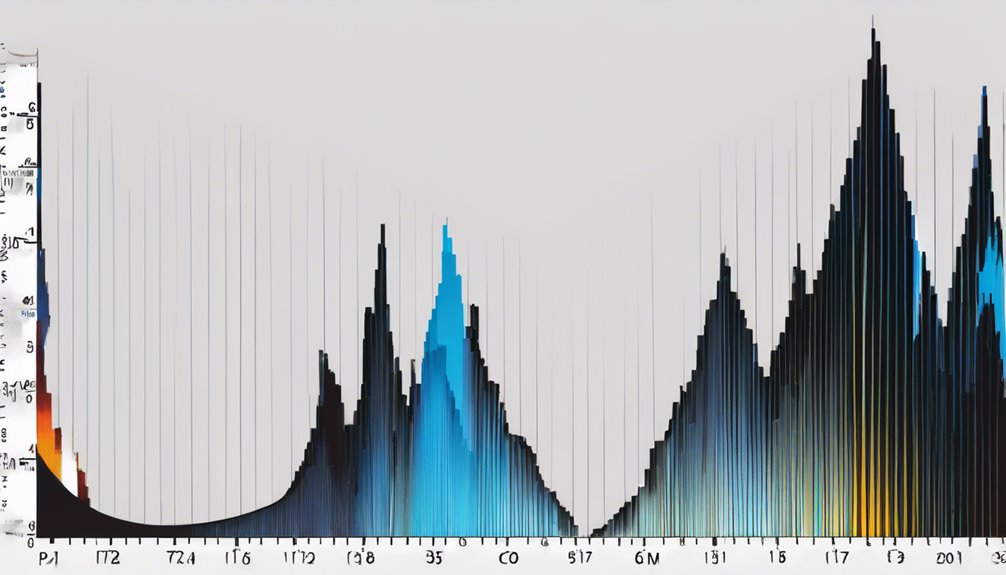
A left skewed histogram, unlike its right skewed counterpart, features most of the data clustered on the right side, with a tail that extends towards the left. This means you'll typically find a higher concentration of values on the right, while fewer values appear as you move leftward.
In this type of distribution, the mean is usually less than the median, indicating that lower values are pulling the average down. You'll also notice that outliers on the left side can significantly affect the shape of the histogram.
Understanding these characteristics helps you analyze data more effectively, especially when identifying trends or making predictions. Recognizing a left skew can provide valuable insights into the underlying dataset.
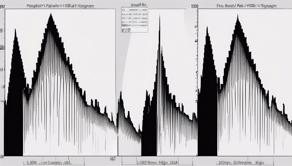
Visual Differences Between Right and Left Skewed Histograms
While examining histograms, you'll quickly notice the distinct visual differences between right skewed and left skewed distributions.
In a right skewed histogram, the tail extends to the right, indicating that a larger number of data points lie on the lower end of the scale. You'll see a concentration of bars toward the left side, with fewer values stretching out to the right.
Conversely, a left skewed histogram features a tail that extends to the left, showcasing more data points on the higher end. Here, the majority of bars will be on the right side, with fewer values trailing off to the left.
These visual cues can help you easily identify the nature of the data distribution at a glance.
Implications of Skewness in Data Analysis

Understanding skewness in your data isn't just about recognizing patterns; it can significantly impact your analysis and conclusions. When you identify a right or left skew, you gain insights into the distribution's characteristics.
For instance, a right-skewed distribution often indicates that outliers or extreme values are affecting your dataset, which can mislead your interpretations. Conversely, a left-skewed distribution suggests that lower values dominate, potentially masking important trends.
You'll want to consider skewness when choosing statistical methods too; some techniques assume normality. Ignoring skewness can lead to incorrect assumptions and flawed decisions.
Real-World Examples of Right and Left Skewed Distributions
Real-world examples of right and left skewed distributions can be found across various fields, shedding light on how skewness impacts data interpretation.
For instance, income distribution often shows a right skew, where a small number of individuals earn significantly more than the average, dragging the mean upwards.
On the flip side, test scores in a well-designed assessment might exhibit left skewness if most students score high, with only a few struggling.
Similarly, the age at retirement often displays a left skew, as most people retire around a common age but a few continue working well into their senior years.
Recognizing these patterns helps you better understand and analyze data, leading to more informed decisions.
Techniques for Analyzing Skewed Data
When you're analyzing skewed data, employing specific techniques can help you uncover meaningful insights.
Start by visualizing your data with histograms or box plots to identify the skewness. If you're facing right skew, consider using logarithmic transformations to normalize your data. For left skew, square root or exponential transformations can be beneficial.
Additionally, calculating measures of central tendency, like median and mode, can provide a clearer picture than the mean, which might be misleading. You might also want to apply robust statistical methods that are less influenced by outliers.
Lastly, breaking down the data into segments can reveal patterns hidden within the skew, giving you a more comprehensive understanding of the dataset.
Conclusion
In summary, recognizing the differences between right and left skewed histograms is essential for effective data analysis. By understanding their characteristics and implications, you can better interpret your data and make informed decisions. Whether you're dealing with a right skewed distribution that highlights a few high values or a left skewed one where lower values dominate, knowing how to analyze these patterns will enhance your insights and improve your overall data interpretation skills.